陈瑞渝
摘要
《 汉语学志 》以 “银色” 为象征亦为方法:安静而锋利、常新而克制。版式采取严格网格与最小干预,并置宋体与英文无衬线,让文字出场。
https://doi.org/10.64053/FYZA7056
“我们的语言是简洁、优美、准确、诚实的。我们将用汉语剖析我们的顽疾和偏见,改变我们对重要问题的认知,也让汉语常新。” ——《 汉语学志 》创刊词
这一段话,既是我们刊物的愿景,也是这本杂志的视觉与设计策略的出发点。
一种语言的衰弱,不只意味着词汇的退化,更意味着思考方式的退化。
中文正在面对这样的挑战:公共语境中,欲言又止的表达越来越多,直指问题的语言越来越少;信息的密度不减,内容的质量却难以匹配;而在面对时代重大问题时,中文反而显得力不从心。这并非语言本身的局限,而是我们在使用中文时,逐渐放弃了它原有的锋利、节制与诚实。
在创办《 汉语学志 》的过程中,我们始终思考一个问题:当汉语正在滑入空洞、平庸、支离破碎的状态时,我们能否用一种有尊严的语言,重新谈论真实的问题?
我们不是要制造 “文化符号” 或 “视觉爆点”,我们更关心的是 —— 一种语言的命运是否还能被思想和诚实的表达所扭转?
因此,我们的视觉设计策略并不以 “吸引眼球” 为第一目标,而是希望传达一种明确的立场:我们相信汉语依然可以剖析现实、承载思想,并在时代的迷雾中发出属于它的光芒。
为什么是银色?
我们为《 汉语学志 》选择 “银色” 作为主色,不是因为它吸睛或潮流,而是因为它具有稀有的象征性,是对我们刊物精神气质的象征性回应。在我们的发刊词中,郭老师写到:“我们将用汉语剖析我们的顽疾和偏见,改变我们对重要问题的认知,也让汉语常新。”
银色最能体现剖析和常新。
它不喧哗、不张扬,却自有光芒;它冷静、理性、克制,却又锋利、有力,是在喧嚣时代中依旧坚持清晰思考的象征。银色的光不是耀眼的,而是穿透沉默的。
在色彩选择过程中,我们曾考虑蓝色。蓝色诚实、理性,却缺乏锋芒,也稍显疏离,缺少一种人文的温度。因此,最终我们选择了银色。
在一个图像泛滥、语言滑落的时代,我们相信,汉语依然可以承载深度与真实。银色象征着这份信念 —— 它不是烈焰,但可以照见黑夜;不是喧闹,但能穿透沉默。银色像是锋利的刀刃,在不动声色中剖开顽疾。在最深的黑暗中,它依然反射思想的微光 —— 真正的思想不需要靠声量取胜,而是靠洞见穿透迷雾。银色是我们对思考深度的坚持,也是我们对语言锋利感的回望。
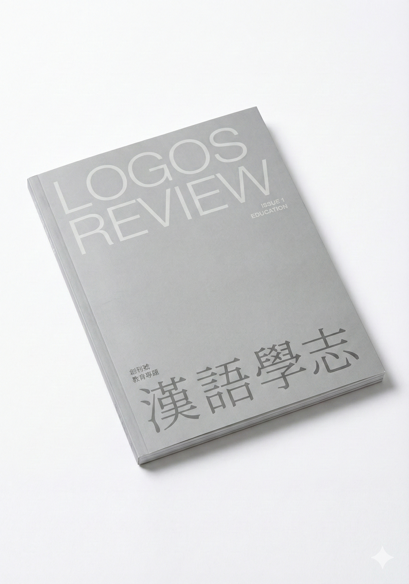
银色不仅贯穿封面印刷,也点缀于内页和网页设计的多个层级。它不是背景色,而是一种方法论:在视觉上剖开噪音,让语言本身站出来。
板式与版面结构:节制的秩序
排版方面,我们采用干净、严谨的网格系统,以最小限度的设计干预,支持文本本身的清晰度。
我们调研了多种注重内容的学术杂志,如《 哈佛商业评论 》《 哈佛法律评论 》《 Nature 》以及《 哈佛设计杂志 》。其中,《 哈佛商业评论 》的内页属于典型的商业杂志排版,色彩丰富,配图大量,广告众多,信息密度高却略显喧闹;《 哈佛法律评论 》则走向另一个极端,纯文字、无色彩、排版工整,视觉语言显得极具权威却少了真实感;《 Nature 》的风格更接近商业杂志,视觉流程化,内容密度高但不够克制。
最终,《 哈佛设计杂志 》的排版风格最契合我们的目标。它兼具图像的信服力与色彩的节制感,配合利落的版式设计、清晰的信息呈现和优质的纸张手感,使其既真实又权威。
参考 《 哈佛设计杂志 》,我们希望让排版 “隐身”,让文字显形。不是去风格化,而是让风格服从语言的逻辑与重量。
在这样一个视觉张力饱和的世界里,清晰本身就是一种力量。我们不试图通过装饰赢得注意力 —— 我们相信,信息的权威感并不来自视觉的厚重堆叠,而来自排布的逻辑与语言的诚实。
在视觉节奏上,我们不寻求过度的风格化表现,而更强调一种 “让内容自己呼吸” 的节制空间,并通过秩序恢复阅读的节奏。对我们来说,克制不等于贫瘠,而是一种针对语言现状的回应,我们要让读者专注于文字本身,而不是被形式诱导分心。
字体策略:一种思想的张力结构
在字体系统上,我们有意并置中文宋体与英文无衬线体( sans serif ),不仅出于视觉美学的考量,更是一次语言哲学的实验。
宋体,源自古籍印刷传统,是中文思想的载体之一。它有笔锋、有韵律,是温和、耐看的存在,传达出一种思想的稳定性与延续感。而英文无衬线体代表当代的信息结构、清晰度与效率,它冷静、干净、直达核心,具有一种时代性与理性。
我们并不追求它们的风格统一,而是强调语言 / 思想之间的张力。在视觉上,它们并不 “对称”,但正是这种不对称的组合,构成了一种思想的张力和路径的多元性。这种搭配让一种文脉深远的文字( 汉语 ),在另一种结构简洁的系统中获得被重新排列、被重新阅读的可能。
宋体低声思考,无衬线清晰呈现,这不仅是一句关于字体的判断,也是一种思想的立场,既是视觉策略,也是世界观。
在今天这个世界,“设计” 常常意味着包装、吸引注意力、服务于算法分发。而我们希望,《 汉语学志 》的设计能成为一种反向的提醒:在深度稀缺的年代里,让语言锋利,让思想得以安放,是视觉工作者更本质的职责。
在今天这个世界,“设计” 往往被简化为一种视觉策略:包装概念、吸引注意力、服务于流量与算法分发机制。设计被要求快速出效果、迅速抓人眼球,以适应信息爆炸与传播节奏加快的现实。这种趋势下,视觉工作者的角色,常常变成了 “流量入口” 的优化器,甚至成为短暂注意力经济的附庸。
但我们希望,《 汉语学志 》的设计可以成为一种反向的提醒 —— 提醒我们设计不仅是装饰语言的外衣,更应是承载语言深度与思想重量的结构本身。
在一个深度稀缺、表达被过度简化的时代,我们相信,设计的真正职责,不是去取悦,而是去支撑 —— 支撑那些需要被认真传递的语言,支撑那些在浮躁语境中依然坚持思考的声音。
设计可以是锋利的:它划破喧嚣,让文字重新聚焦; 设计也可以是温柔的:它为思想创造栖居之所,让复杂被耐心理解。
在我们眼中,真正有力量的设计,不是视觉的膨胀,而是视觉的节制与深度。让语言锋利,让思想得以安放——这不仅是我们的设计目标,也是我们作为视觉工作者的职责所在。
<全文完>
The Silver Language: Reshaping the Power of Chinese in a Noisy Age
Ruiyu Chen
Abstract
Logos Review adopts silver as both symbol and method—quiet yet incisive, ever-renewing yet restrained. The layout uses a strict grid and minimal intervention, juxtaposing Chinese Songti with English sans serif so that the words themselves come to the fore.
https://doi.org/10.64053/FYZA7056
“Our language is concise, elegant, precise, and honest. We will use Chinese to analyze our longstanding problems and biases, shift our perspective about important issues, and ensure that the language continues to evolve.” — Han Yu Xuezhi, Founding Statement
This sentence is not only the vision of our publication—it is also the starting point of our visual and design strategy.
The weakening of a language does not merely mean a loss of vocabulary. It marks a deeper erosion: the fading of a way of thinking.
The Chinese language today is facing this challenge. In the public sphere, vague, half-spoken expressions are becoming commonplace; direct, clear language is in decline. The volume of information hasn’t decreased, but its quality struggles to keep up. When confronted with pressing issues of our time, Chinese often feels inadequate—not because the language lacks power, but because we have gradually abandoned its innate clarity, restraint, and honesty.
In creating Logos Review, we kept asking ourselves: As Chinese slips into hollowness, mediocrity, and fragmentation, can we still speak truthfully, with dignity, in this language?
We are not here to create cultural icons or visual gimmicks.What really matters to us is this: Can we still change the future of a language through thought and honest expression?
Thus, our visual strategy focuses first on making a strong statement, rather than just “grabbing attention.” We [at Logos Review] believe that Chinese culture can still analyze reality, convey meaningful ideas, and shine brightly in a world filled with uncertainty.
Why Silver?
We chose silver as the primary color for Logos Review, not because it is trendy or eye-catching, but because it holds a unique symbolic quality that aligns with the spirit of our publication. As it is written in the founding statement: “We will use Chinese to dissect our chronic problems and biases, change the way we think about important issues, and keep the Chinese language ever-evolving.”
Silver best embodies both (analysis) dissection and(evolution) renewal.
It is quiet and unassuming, yet luminous; calm, rational, and restrained, yet sharp and powerful. It symbolizes the persistence of clear thinking in a noisy age. The light of silver is not dazzling, but it penetrates silence.
During the color selection process, we considered both blue and silver. Blue represents honesty and reason, but it lacks edge and feels too emotionally detached. In contrast, silver carries sharpness with calmness, combining clarity with humanity.
In an age saturated with images and diminished language, we believe Chinese can still carry depth and truth. Silver stands for this belief: it is not blazing fire, but it can illuminate the night. It is not loud, but capable of piercing silence. It is like a blade, slicing through afflictions with subtle precision. Even in the deepest darkness, it reflects the faint light of thought — true thinking does not triumph through noise but through insight. Silver is our commitment to intellectual depth and a tribute to the sharpness of language.
Silver permeates not just our cover printing, but also accents the inner layout and digital design. It is not merely a background color, but a methodology: a visual technique that cuts through noise and lets the language emerge.
Layout and Structure: Disciplined Order
In our layout strategy, we adopt a clean, rigorous grid system that supports textual clarity with minimal design intervention.
We conducted reserach on the visual identity of other content-driven academic journals, such as Harvard Business Review (2-4), Harvard Law Review (5-6), Nature (7-8), and Harvard Design Magazine (9-11). The inner layout of Harvard Business Review is typical of commercial magazines—rich in color, abundant in illustrations, and filled with advertisements.
Harvard Law Review, by contrast, presents a starkly different tone: purely typographic, highly structured, with no color use. Its layout conveys a sense of authority but lacks emotional resonance.
Nature is closer in format to Harvard Business Review, also using a commercial magazine structure. Among these publications, Harvard Design Magazine is the one we look to for inspiration for our visual identity
Our own visual language must first and foremost reflect our editorial tone—simplicity, authority, and authenticity. Harvard Business Review and Nature suffer from visual over-saturation and standardized layouts, which compromise both clarity and authority.Meanwhile, Harvard Law Review is authoritative, but so much so that it loses a sense of human realism.
Harvard Design Magazine, on the other hand, achieves a compelling balance. Its use of images and color is believable and restrained. Paired with sharp layout design, clear information structure, and high-quality tactile experience, it manages to be both credible and authoritative.
Following this model, we want the layout to “disappear,” and the text to come forward—not by removing style, but by letting style serve the logic and weight of language.
In a world oversaturated with visual tension, clarity is power. We don’t attempt to capture attention with decoration. We believe that authority comes not from visual volume but from the logic of arrangement and the honesty of language.
In terms of visual rhythm, we avoid excessive stylization. Instead, we emphasize a restrained space where content can breathe. Through order, we restore a natural reading rhythm. For us, restraint is not a lack, but a response to the current state of language. Our goal is to help readers focus on the text itself, not be distracted by form.
Typography: A Tension Structure of Thought
Our typography strategy purposefully juxtaposes Chinese Songti with English sans-serif fonts. This decision is both aesthetic and philosophical. Songti, rooted in classical Chinese printing traditions, is a bearer of thought in Chinese culture. It has brush-like strokes and rhythm, offering a visual sense of stability and continuity. In contrast, the sans-serif font reflects contemporary values of structure, clarity, and efficiency — it is calm, clean, and direct. We are not trying to unify these styles, but to highlight their tension. Visually, they are not symmetrical, yet this very asymmetry creates intellectual tension and allows for multiple pathways of interpretation. This pairing enables a deeply sentimental language (Chinese) to be rearranged and re-read through a more minimal and rational system. Songti thinks quietly. Sans-serif speaks clearly. This constrast is more than a typographical description — it is a philosophical stance. It is both a visual strategy and a worldview.
In today’s world, design is often reduced to a visual strategy: packaging ideas, attracting attention, and serving the demands of traffic and algorithmic distribution. Designers are expected to produce immediate impact and capture interest quickly, adapting to the accelerating pace of information and media. In such a context, the role of the layout artist is frequently diminished to that of an “entry-point optimizer”—a facilitator of the attention economy, sometimes even its subordinate.
With Logos Review, we hope design can serve as a quiet counterpoint —a reminder that design is not merely the decorative shell of language, but the very structure that bears its depth and intellectual weight.
In a time where depth is scarce and expression is overly simplified, we believe the true role of design is not to please, but to support—to support the kinds of language that deserve to be heard, and to hold up the voices that continue to think critically in an agitated world.
Design can be sharp: it cuts through the noise, bringing focus back to the text.
Design can be gentle: it creates a space where thought can rest and complexity can be understood with enough patience.
To us, truly powerful design sharpens language and provides a dwelling place for thought. Creating a space to think deeply is not only our design aspiration, but the weightier responsibility we carry as visual practitioners.