
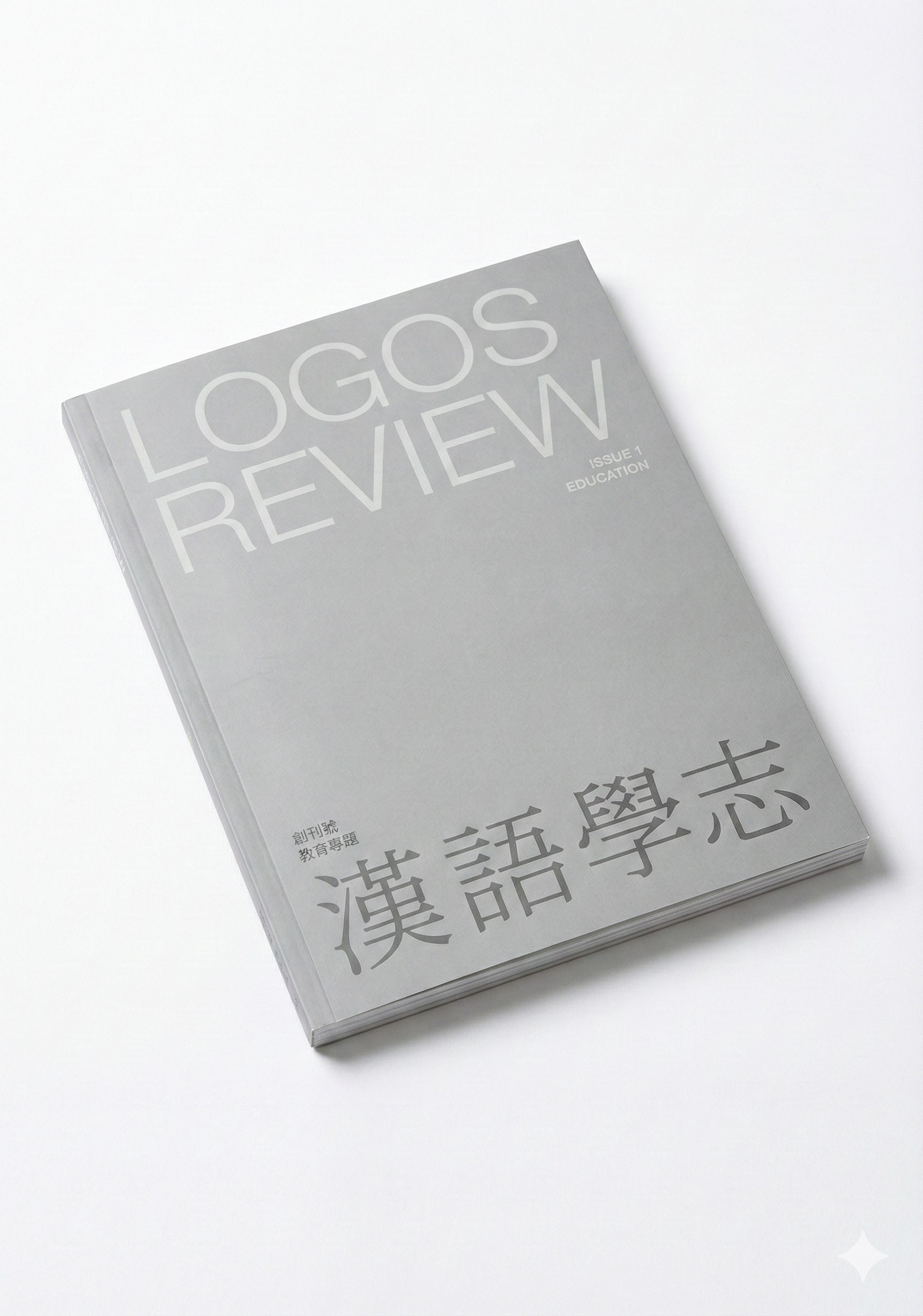
Logos Review · Issue 1 (Spring 2026) · Notes
Ruiyu Chen
Abstract
Logos Review adopts silver as both symbol and method—quiet yet incisive, ever-renewing yet restrained. The layout uses a strict grid and minimal intervention, juxtaposing Chinese Songti with English sans serif so that the words themselves come to the fore.
https://doi.org/10.64053/FYZA7056
“Our language is concise, elegant, precise, and honest. We will use Chinese to analyze our longstanding problems and biases, shift our perspective about important issues, and ensure that the language continues to evolve.” — Han Yu Xuezhi, Founding Statement
This sentence is not only the vision of our publication—it is also the starting point of our visual and design strategy.
The weakening of a language does not merely mean a loss of vocabulary. It marks a deeper erosion: the fading of a way of thinking.
The Chinese language today is facing this challenge. In the public sphere, vague, half-spoken expressions are becoming commonplace; direct, clear language is in decline. The volume of information hasn’t decreased, but its quality struggles to keep up. When confronted with pressing issues of our time, Chinese often feels inadequate—not because the language lacks power, but because we have gradually abandoned its innate clarity, restraint, and honesty.
In creating Logos Review, we kept asking ourselves: As Chinese slips into hollowness, mediocrity, and fragmentation, can we still speak truthfully, with dignity, in this language?
We are not here to create cultural icons or visual gimmicks.What really matters to us is this: Can we still change the future of a language through thought and honest expression?
Thus, our visual strategy focuses first on making a strong statement, rather than just “grabbing attention.” We [at Logos Review] believe that Chinese culture can still analyze reality, convey meaningful ideas, and shine brightly in a world filled with uncertainty.
Why Silver?
We chose silver as the primary color for Logos Review, not because it is trendy or eye-catching, but because it holds a unique symbolic quality that aligns with the spirit of our publication. As it is written in the founding statement: “We will use Chinese to dissect our chronic problems and biases, change the way we think about important issues, and keep the Chinese language ever-evolving.”
Silver best embodies both (analysis) dissection and(evolution) renewal.
It is quiet and unassuming, yet luminous; calm, rational, and restrained, yet sharp and powerful. It symbolizes the persistence of clear thinking in a noisy age. The light of silver is not dazzling, but it penetrates silence.
During the color selection process, we considered both blue and silver. Blue represents honesty and reason, but it lacks edge and feels too emotionally detached. In contrast, silver carries sharpness with calmness, combining clarity with humanity.
In an age saturated with images and diminished language, we believe Chinese can still carry depth and truth. Silver stands for this belief: it is not blazing fire, but it can illuminate the night. It is not loud, but capable of piercing silence. It is like a blade, slicing through afflictions with subtle precision. Even in the deepest darkness, it reflects the faint light of thought — true thinking does not triumph through noise but through insight. Silver is our commitment to intellectual depth and a tribute to the sharpness of language.
Silver permeates not just our cover printing, but also accents the inner layout and digital design. It is not merely a background color, but a methodology: a visual technique that cuts through noise and lets the language emerge.
Layout and Structure: Disciplined Order
In our layout strategy, we adopt a clean, rigorous grid system that supports textual clarity with minimal design intervention.
We conducted reserach on the visual identity of other content-driven academic journals, such as Harvard Business Review (2-4), Harvard Law Review (5-6), Nature (7-8), and Harvard Design Magazine (9-11). The inner layout of Harvard Business Review is typical of commercial magazines—rich in color, abundant in illustrations, and filled with advertisements.
Harvard Law Review, by contrast, presents a starkly different tone: purely typographic, highly structured, with no color use. Its layout conveys a sense of authority but lacks emotional resonance.
Nature is closer in format to Harvard Business Review, also using a commercial magazine structure. Among these publications, Harvard Design Magazine is the one we look to for inspiration for our visual identity
Our own visual language must first and foremost reflect our editorial tone—simplicity, authority, and authenticity. Harvard Business Review and Nature suffer from visual over-saturation and standardized layouts, which compromise both clarity and authority.Meanwhile, Harvard Law Review is authoritative, but so much so that it loses a sense of human realism.
Harvard Design Magazine, on the other hand, achieves a compelling balance. Its use of images and color is believable and restrained. Paired with sharp layout design, clear information structure, and high-quality tactile experience, it manages to be both credible and authoritative.
Following this model, we want the layout to “disappear,” and the text to come forward—not by removing style, but by letting style serve the logic and weight of language.
In a world oversaturated with visual tension, clarity is power. We don’t attempt to capture attention with decoration. We believe that authority comes not from visual volume but from the logic of arrangement and the honesty of language.
In terms of visual rhythm, we avoid excessive stylization. Instead, we emphasize a restrained space where content can breathe. Through order, we restore a natural reading rhythm. For us, restraint is not a lack, but a response to the current state of language. Our goal is to help readers focus on the text itself, not be distracted by form.
Typography: A Tension Structure of Thought
Our typography strategy purposefully juxtaposes Chinese Songti with English sans-serif fonts. This decision is both aesthetic and philosophical. Songti, rooted in classical Chinese printing traditions, is a bearer of thought in Chinese culture. It has brush-like strokes and rhythm, offering a visual sense of stability and continuity. In contrast, the sans-serif font reflects contemporary values of structure, clarity, and efficiency — it is calm, clean, and direct. We are not trying to unify these styles, but to highlight their tension. Visually, they are not symmetrical, yet this very asymmetry creates intellectual tension and allows for multiple pathways of interpretation. This pairing enables a deeply sentimental language (Chinese) to be rearranged and re-read through a more minimal and rational system. Songti thinks quietly. Sans-serif speaks clearly. This constrast is more than a typographical description — it is a philosophical stance. It is both a visual strategy and a worldview.
In today’s world, design is often reduced to a visual strategy: packaging ideas, attracting attention, and serving the demands of traffic and algorithmic distribution. Designers are expected to produce immediate impact and capture interest quickly, adapting to the accelerating pace of information and media. In such a context, the role of the layout artist is frequently diminished to that of an “entry-point optimizer”—a facilitator of the attention economy, sometimes even its subordinate.
With Logos Review, we hope design can serve as a quiet counterpoint —a reminder that design is not merely the decorative shell of language, but the very structure that bears its depth and intellectual weight.
In a time where depth is scarce and expression is overly simplified, we believe the true role of design is not to please, but to support—to support the kinds of language that deserve to be heard, and to hold up the voices that continue to think critically in an agitated world.
Design can be sharp: it cuts through the noise, bringing focus back to the text.
Design can be gentle: it creates a space where thought can rest and complexity can be understood with enough patience.
To us, truly powerful design sharpens language and provides a dwelling place for thought. Creating a space to think deeply is not only our design aspiration, but the weightier responsibility we carry as visual practitioners.
This is the English version of an article published in Chinese in Logos Review (汉语学志). Read the Chinese original (中文原文) · All English articles
